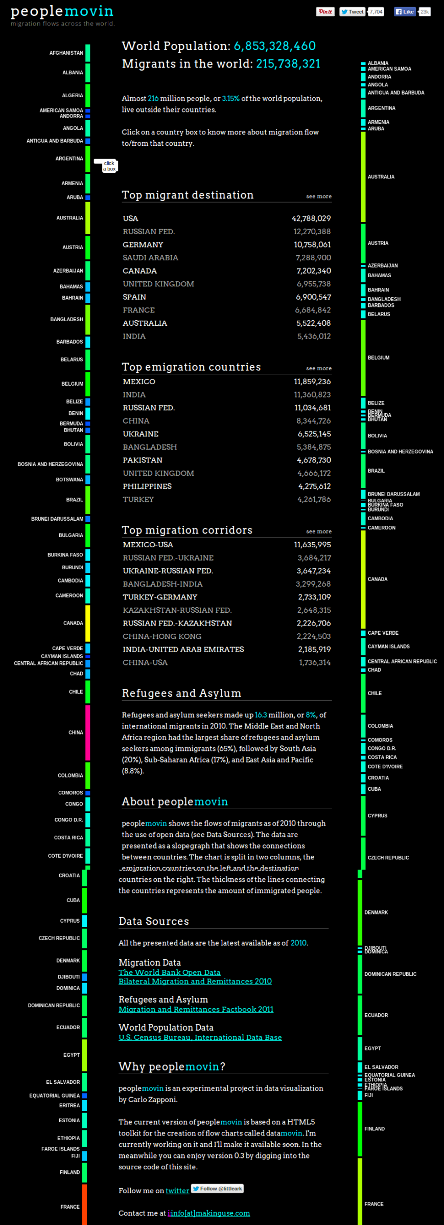
Double click to enlarge.
Source: peoplemovin – A visualization of migration flows.
If you click on the link (above), you can find the number of migrants into and out of every country, and also a breakdown of the destinations of emigrants from every country and the sources of immigration into every country. I think this is interesting, and maybe you will, too.
These figures reflect total numbers of peoples living in a country other than the one in which they were born, as of the year 2010. They do not reflect recent events, such as the Ukrainian civil war or the Syrian refugee crisis.
∞∞∞
My conclusions and impressions:
- My own country, the United States of America, is by far the world’s greatest destination for immigrants. More than one in five of the world’s migrants live in the USA.
- Although 13.8 percent of US residents are foreign-born, this is less than Canada’s 21.3 percent or Australia’s 25.7 percent. Countries I don’t think of as immigrant destinations, such as Spain and Sweden, have as high a percentage of foreign-born as the United States. About 19.4 percent of Irish residents are foreign-born.
- A lot of people have moved in and out of Russia, although the numbers are comparatively small as a percentage of the Russian population. I can think of different ways to interpret this, although I’m not sure any of them is correct. One is that an ethnic sorting is going on among the former Soviet republics. The worst possibility is that Russia is losing educated, professional people and gaining low-paid, unskilled workers.
- Iran is the largest destination for emigrants from both Afghanistan and Iraq. The largest destination for Iranian emigrants is the USA.
- About 66 percent of the residents of the United Arab Emirates are immigrants, mostly low-paid workers from the Indian subcontinent. About 28.3 percent of residents of Saudi Arabia are foreign-born workers.
I’d be interested to know what nuggets others find in the data.
Tags: Emigration, Migration, Population, Russia, United States

October 19, 2015 at 9:29 am |
Hi Phil
Interesting graphic and analysis.. what struck me was Mexico being ahead of India in emigration given the significant population of the latter. I would have liked to see the numbers on a per capita basis. Your thoughts on Russia make sense. The UK and India also have high I/E numbers, wonder if the same thinking applies…
Anyway, interesting! My partner is Portuguese and over the last few years a 1/2 million left their country – it’s a big topic in this household. Thank you for posting.
LikeLike
October 19, 2015 at 9:44 am |
You can get most of the information you want on the original linked site.
It gives the total population, total number of emigrants and total number of immigrants for each country as of 2010.
India had a total population of 1.17 billion, including 5.4 million immigrants, but 11.3 million people born in India were living in other countries. Emigration from India, in other words, was about 1 percent of the population.
The largest destination for emigrants from India, as the main chart shows, was the United Arab Emirates. The largest source of immigrants was Bangladesh.
The UK had a population of 62.9 million, including just under 7 million immigrants, and 4.7 million British-born people living in other countries.
The largest destination for emigrants from the UK was Australia. The largest source of immigrants was from India.
Portugal had a population of 10.7 million, including 918,626 immigrants, but 2.3 million people born in Portugal were living in other countries. Emigration from Portugal was more than one-fifth the population.
The largest destination for emigrants from Portugal was to France and the largest source of immigrants was from Angola.
You can get more detailed figures on the web site.
I find this stuff fascinating.
LikeLike